Instructional graphics and layout
A ten-slide beginner's guide to a ketovore way of eating. The first version was a graded slide deck; the revision rebuilt it in HTML to fix what the feedback exposed about navigation, signaling, and cognitive load.
The problem
Adults starting a restrictive way of eating are handed dense information at the moment they are least able to absorb it. The assignment was a ten-slide introduction; the design problem was making dense content readable without dumbing it down.
Who it was for
Adults new to low-carb eating, reading on their own, likely on a phone, with no instructor present.
What I analyzed
- The instructor's feedback on the first version (graded 80/100): navigation was linear only, bullets arrived all at once, image sources were not visible, and the "why this topic" rationale was missing.
- Which multimedia principles the deck violated. Presenting every bullet at once ignored segmenting; no advanced organizer meant each slide arrived without context.
What I decided, and why
- Rebuild in HTML instead of re-editing the deck, so navigation could be non-linear: a table-of-contents sidebar, working Home, Back, and Next, and a separate end slide.
- Progressive reveal with grey-out of points already covered, so the reader's attention stays on one idea at a time.
- An advanced-organizer preview at the end of each slide, and a rationale on slide one, so the reader always knows why this and what is next.
- Visible image citations and one student-made SVG illustration with a text overlay, applying contiguity rather than separating picture from caption.
What I built
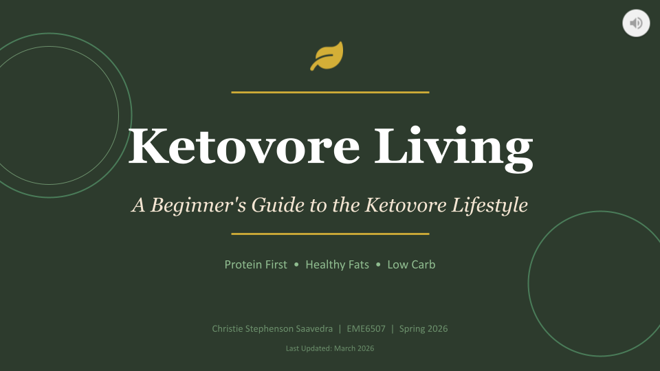
The original Google Slides deck and the revised HTML presentation, with the cover, layout system, and illustration.
Result
Every item in the feedback is addressed in the revision. The before and after are both linked so the change is visible rather than claimed.