Healthcare operations dashboard
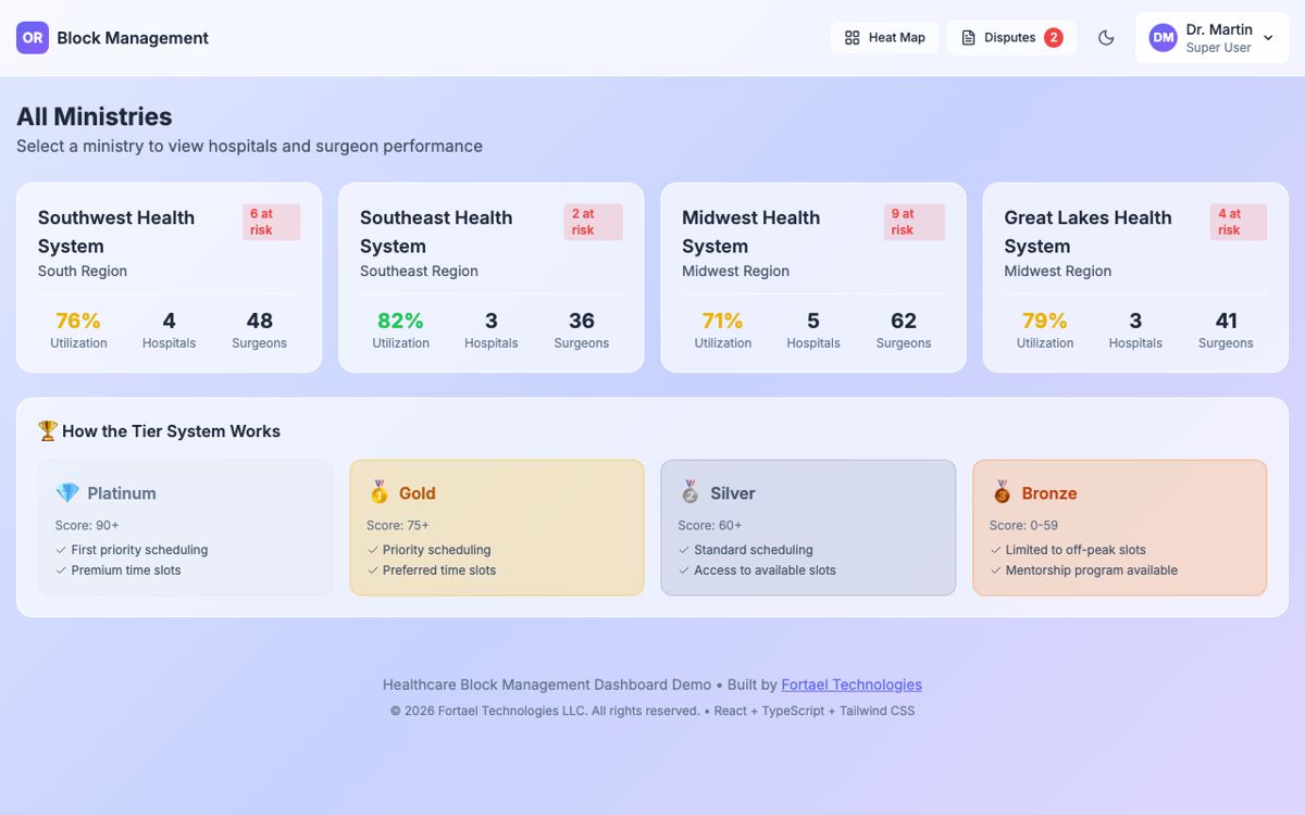
A multi-hospital health system tracked operating-room utilization with quarterly PDF reports. I built a working prototype that the client's engineer then used to interview OR managers about what they actually needed. The prototype became the requirements.
The problem
Leadership knew operating rooms were under-used but could not say where or why. The only data arrived quarterly as a PDF, with no way to drill into a unit, a room, or a surgeon. And any attempt to show surgeon-level numbers ran into a second problem: physicians read performance data as surveillance, and a tool they distrust does not get used.
Who it was for
Five roles with different needs and different sensitivities: system administrators, hospital directors, schedulers, unit managers, and surgeons. The people who would answer requirements questions were OR managers, who had never seen a live view of their own rooms.
What I analyzed
- The information hierarchy people actually think in: Region, Hospital, Unit, Room, Surgeon. That became the navigation.
- What each role is allowed to see, and what each role is afraid of seeing published about them.
- How the existing quarterly report was used, which showed that the number people wanted was not utilization itself but "which of my rooms is the problem this week."
What I decided, and why
- Build a working prototype instead of wireframes. OR managers cannot react to a static mock-up of a tool they have never had. Clicking through real (sample) data produced better requirements in one session than a survey would have in a month.
- Tiers, not rankings. Surgeons are grouped into performance tiers with configurable weights by specialty. It preserves accountability without a public leaderboard, which is what would have killed adoption.
- A dispute workflow built in. If a surgeon believes a metric is wrong, there is a path to contest it inside the tool. Trust in the data is a feature, not a rollout task.
- Role-based views from day one, so the same screen shows a scheduler and a surgeon different things without a second product.
What I built
An interactive React/TypeScript dashboard with a role switcher, four-level drill-down, configurable weighted metrics, tier grouping, a calendar view of utilization over time, and the dispute workflow. Built with AI-assisted development so that stakeholder feedback could be turned into a new build between sessions.
Result
The client's engineer used the prototype to gather requirements from OR managers across the system. Additional features surfaced in those sessions and were carried into the production plan. The interactive demo is still live.